React Component Composition - Compound Pattern
By Hemanta Sundaray on 2023-02-16
In React, "component composition" means putting together smaller, reusable components together to build more complex UI components. This approach is central to the way React is designed and encourages developers to break their user interface down into smaller, more manageable pieces.
By breaking UI components down into smaller pieces, it becomes easier to reason about how they work and how they can be used. This makes it simpler to build and maintain complex user interfaces with a large number of interacting components.
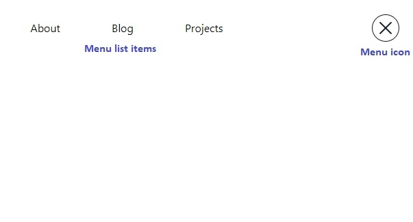
Let’s say you want to create a Hamburger menu that looks like the following:
The menu is composed of two components - the menu icon and the menu items - that all work together to perform a single task.
To create this hamburger menu, one option is to create a single monolithic component, responsible for rendering both the menu icon and the menu items.
The problem with this option is that the code becomes difficult to maintain and scale as the number of features and interactions grows. Additionally, if we wanted to reuse the menu icon or the menu items in another part of our application, we would need to extract the relevant code and modify it to fit the new context. This can lead to duplicated code.
Solution? Compound pattern.
The compound pattern in React allows us to create components that all work together to perform a single task.
In this pattern, the compound component acts as a container for the smaller, related components. The compound component takes care of coordinating the behavior and appearance of the smaller components and provides a unified API for interacting with them
To create the hamburger menu using the compound pattern, we can break down the menu into smaller components and combine them into a single compound component.
Consider the example below:
import React from "react";
import { useCycle } from "framer-motion";
import { motion, AnimatePresence } from "framer-motion";


const HamburgerContext = React.createContext();


export function Hamburger({ children }) {
  const [open, cycleOpen] = useCycle(false, true);


  return (
    <HamburgerContext.Provider value={{ open, cycleOpen }}>
      {children}
    </HamburgerContext.Provider>
  );
}


const IconBarOneVariants = {
  initial: {
    rotate: "0deg",
    transition: {
      ease: "easeOut",
    },
  },
  animate: {
    y: "3px",
    rotate: "45deg",
    transformOrigin: "center center",
    transition: {
      ease: "easeOut",
    },
  },
};
const IconBarTwoVariants = {
  initial: { rotate: "0deg" },
  animate: {
    y: "-3px",
    rotate: "-45deg",
    transformOrigin: "center center",
    transition: {
      ease: "easeOut",
    },
  },
};


function Icon() {
  const { open, cycleOpen } = React.useContext(HamburgerContext);


  return (
    <div className="grid place-items-center fixed top-6 right-6 border border-gray-900 w-10 h-10 rounded-full">
      <motion.div
        className="flex flex-col justify-between w-6 h-2 cursor-pointer"
        onClick={cycleOpen}
      >
        <motion.div
          variants={IconBarOneVariants}
          initial="initial"
          animate={open ? "animate" : "initial"}
          className="bg-gray-900 w-full h-0.5"
        ></motion.div>
        <motion.div
          variants={IconBarTwoVariants}
          initial="initial"
          animate={open ? "animate" : "initial"}
          className="bg-gray-900 w-full h-0.5"
        ></motion.div>
      </motion.div>
    </div>
  );
}


const ListItemsVariants = {
  initial: {
    x: "-0.2rem",
    opacity: 0,
    transition: {
      ease: "easeOut",
      staggerChildren: 0.1,
    },
  },
  animate: {
    x: 0,
    opacity: 1,
    transition: {
      ease: "easeOut",
      staggerChildren: 0.1,
    },
  },
};


function ListItems({ children }) {
  const { open } = React.useContext(HamburgerContext);


  return (
    <AnimatePresence>
      {open && (
        <nav className="grid place-items-center w-1/3 h-10 m-auto mt-6">
          <motion.ul
            variants={ListItemsVariants}
            initial="initial"
            animate="animate"
            exit="initial"
            className="flex justify-between w-full"
          >
            {children}
          </motion.ul>
        </nav>
      )}
    </AnimatePresence>
  );
}


function Item({ children }) {
  return <motion.li variants={ListItemsVariants}>{children}</motion.li>;
}


Hamburger.Icon = Icon;
Hamburger.ListItems = ListItems;
Hamburger.Item = Item;
Here, we have a single file named Hamburger.js that contains the following components:
- Hamburger.js: The
HamburgerMenucomponent is a compound component that serves as a container for the smaller components. It defines a context objectHamburgerContextusing the Context API and provides its child components with access to theopenandcycleOpenvalues through theHamburgerContext.Provider. This makes it easy for child components to access and modify these values without having to pass them down manually as props. - Icon.js: The
Iconcomponent renders the hamburger icon with two lines that animate to form an 'X' shape when theopenstate is toggled. - ListItems.js: The
ListItemscomponent is responsible for rendering a list of menu items when the hamburger icon is clicked. Item.js: TheItemcomponent renders a single menu item.
It's worth paying close attention to the final three lines (127-129) of the code snippet above. Notice that we have added Icon, ListItems, and Item components as properties of the Hamburger function component.
Note that when you define a component in React, you are actually defining a function that returns some JSX. And in JavaScript, functions are also objects. As a result, you can add properties to a function just like you would with any other object.
The reason we have added the Icon, ListItems, and Item components as properties of the Hamburger component is because they are closely related to it and depend on the state managed by the Hamburger component. By doing this, we are indicating that these components are child components that are part of the Hamburger component's implementation. This ensures that they are always used together with the Hamburger component, and any changes made to the Hamburger component's internal implementation can be easily reflected in these components.
Now, we can compose the Hamburger, the Hamburger.Icon, the Hamburger.ListItems and Hamburger.Item components to create the hamburger menu.
import React from "react"
import { Hamburger } from "./Hamburger"

const HamburgerMenu = () => {
  return (
    <Hamburger>
      <Hamburger.Icon />
      <Hamburger.ListItems>
        <Hamburger.Item>About</Hamburger.Item>
        <Hamburger.Item>Blog</Hamburger.Item>
        <Hamburger.Item>Projects</Hamburger.Item>
      </Hamburger.ListItems>
    </Hamburger>
  )
}

export default HamburgerMenu
Finally, we render the HamburgerMenu component inside the App component:
import React from "react"
import HamburgerMenu from "./components/HamburgerMenu"

const App = () => {
  return <HamburgerMenu />
}

export default App
And that's it. This is how you can utilize the compound pattern in React to build complex and maintainable UIs! If you have any other use cases or examples of how you've used the compound pattern in your own projects, let me know in the comments below!
