Plotting Pie Charts Using Matplotlib
By Hemanta Sundaray on 2022-03-18
We use a pie chart when we want to display elements of a data set as proportions of a whole.
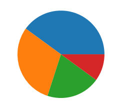
In Matplotlib, we can make a pie chart with the command plt.pie, passing in the values we want to chart:
import matplotlib.pyplot as plt

brand_contribution = [40, 30, 20, 10]

brands=['Ritu Kumar', 'Label', 'Aarke', 'RI']

plt.pie(brand_contribution)
Output:
Pie Chart Labeling
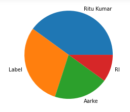
We also want to be able to understand what each slice of the pie represents. To do this, we can put labels on the chart itself:
import matplotlib.pyplot as plt

brand_contribution = [40, 30, 20, 10]

brands=['Ritu Kumar', 'Label', 'Aarke', 'RI']

plt.pie(brand_contribution, labels=brands)
This puts the category names into labels next to each corresponding slice:
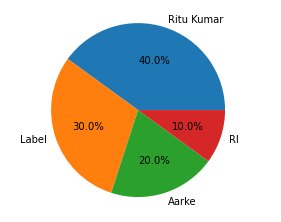
One other useful labelling tool for pie charts is adding the percentage of the total that each slice occupies. Matplotlib can add this automatically with the keyword autopct. We pass in string formatting instructions to format the labels how we want. Some common formats are:
- '%0.2f' — 2 decimal places, like 4.08
- '%0.2f%%' — 2 decimal places, but with a percent sign at the end, like 4.08%. You need two consecutive percent signs because the first one acts as an escape character, so that the second one gets displayed on the chart.
- '%d%%' — rounded to the nearest int and with a percent sign at the end, like 4%.
So, a full call to
plt.piemight look like:
import matplotlib.pyplot as plt

brand_contribution = [40, 30, 20, 10]

brands=['Ritu Kumar', 'Label', 'Aarke', 'RI']

plt.pie(brand_contribution, labels=brands, autopct='%0.1f%%')
and the resulting chart would look like:


