Plotting Bar Charts Using Matplotlib
By Hemanta Sundaray on 2022-04-05
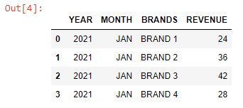
First, we will read an Excel file as a Pandas DataFrame:
import pandas as pd
data = pd.read_excel("BRAND REVENUE.xlsx")
dataWe can create a bar chart using the code below:
import matplotlib.pyplot as plt

brands = data["BRANDS"]
revenue = data["REVENUE"]

plot = plt.bar(brands, revenue)

plt.xticks(brands, rotation=20)

plt.subplots_adjust(top=1.5)

plt.xlabel("Brands")
plt.ylabel("Revenue")
plt.title("BRAND REVENUE - JAN-21")

for rect in plot:
    height = rect.get_height()
    plt.text(rect.get_x() + rect.get_width()/2, 1.002*height,'%d' %
    int(height), ha='center', va='bottom')
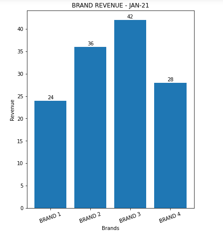
Executing the code block above results in the following bar chart:
And here is the explanation of the code block that created the bar chart:
LINE-6: We have created the bar chart using the .plt.bar() function with two arguments:
- x-values: A list of x-positions for each bar
- y-values: A list of heights for each bar
LINE 8: We have used the rotation keyword to rotate our x labels by 20 degrees.
LINE 10: We have used the plt.subplots_adjust() command with the top keyword argument to add space to the top of the graph.
LINE 16-19: plt.text() within the for loop annotates each bar with its corresponding data value. The first two arguments specify where exactly that data text has to be placed over the bar. Then, the arguments va and ha align the text centrally over the bar.

