CSS - Proportionally Scaling Images
By Hemanta Sundaray on 2021-11-03
import React from "react"

const App = () => {
  return (
    <div className="container">
      <img src="honda.jpg" alt="Honda 650R" />
    </div>
  )
}

export default App
.container {
width: 40rem;
height: 20rem;
border: 0.2rem solid red;
overflow: hidden;
}
.container img {
max-width: 100%;
height: auto;
display: block;
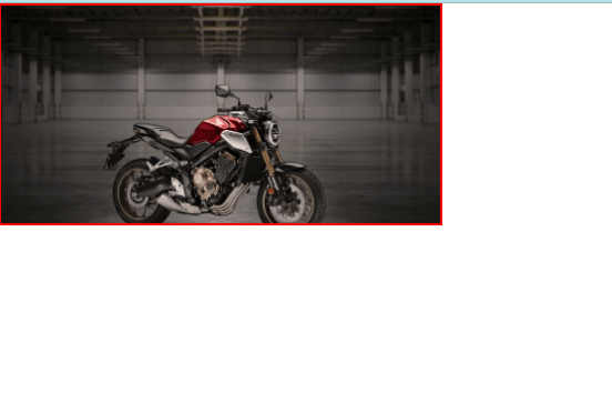
}The second CSS rule ensures that images scale with the width of the container.
The height property is set to auto, meaning an image’s height will automatically scale proportionally with the width.
Finally, the last line will display images as block-level elements (rather than inline-block, their default state). This will prevent images from attempting to align with other content on the page (text), which can add unintended margin to the images.
Scaling background Images
.container {
  width: 40rem;
  height: 20rem;
  background: url("./images/honda.jpg") center no-repeat;
  background-size: cover;
}
The third declaration instructs the CSS compiler to not repeat the image (by default, images will repeat) and centers the image within the element.
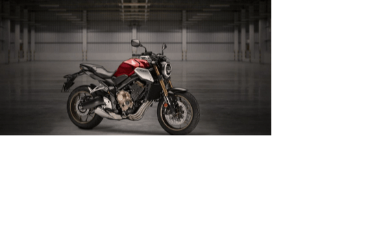
The final declaration scales the background image. The image will cover the entire background of the element, all while keeping the image in proportion.
If the dimensions of the image exceed the dimensions of the container then only a portion of the image will display.

